Citylets mobile
Key Features
- Smartphone optimised
- Google Maps
- Existing HTML
- Javascript gallery
- Forms reworked
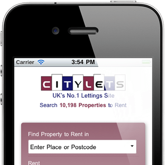
Citylets is the number one UK lettings site, with an emphasis on Scotland and Northern Ireland. Their regular website traffic analysis showed that despite offering mobile apps for Android and iPhone, an increasing number of visitors were using mobile devices.

Search results on an iPhone
The previous site refresh that Carnoustie Creative carried out meant that the site looked good on an iPad or other tablet, but the limited screen size and specific interface and use characteristics of smartphones meant that the user experience could be improved on mobile phones.
They approached us with a specific limitation – the HTML was to remain “as is” – the cost and complexity of delivering a totally different website for mobile users was beyond the scope of the project.
With that restriction, we were able to improve the user experience for mobile users by simplifying and reformatting the existing site. The simple, pared-down layout is designed for “one eye & one thumb” – taking account of the fact that many mobile phone users are browsing with their phone when doing something else like watching TV or using public transport.

Property details with gallery
The three key areas of the site – search, search results and property details were all addressed separately. Features were hidden and disabled to streamline the page and make elements like the Javascript gallery showing property photos, usable in portrait or landscape orientation.
Forms that required data entry were reformatted for easier use and some popup forms and windows removed to keep navigation straightforward.
The mobile version of the site was launched on time and within budget.