Perhaps you’ve read about “responsive” web design or simply heard the term and wondered what it is? Maybe you haven’t heard of it, but either way, if you run a site, a blog or an online store it’s something you should be looking at right now.
In the context of web pages, responsive web design (sometimes abbreviated to RWD) simply means that the page layout responds to the size and capabilities of the computer or device that it is being displayed on. The objective is to give viewers of your web site the best possible viewing experience and one that fits with their expectations.
For example, most traditional computer monitors are wider than they are tall. Most mobile phones are the opposite, having tall, narrow displays. Scrolling up and down is acceptable on a mobile phone, but scrolling sideways is less comfortable, especially when browsing with one hand.
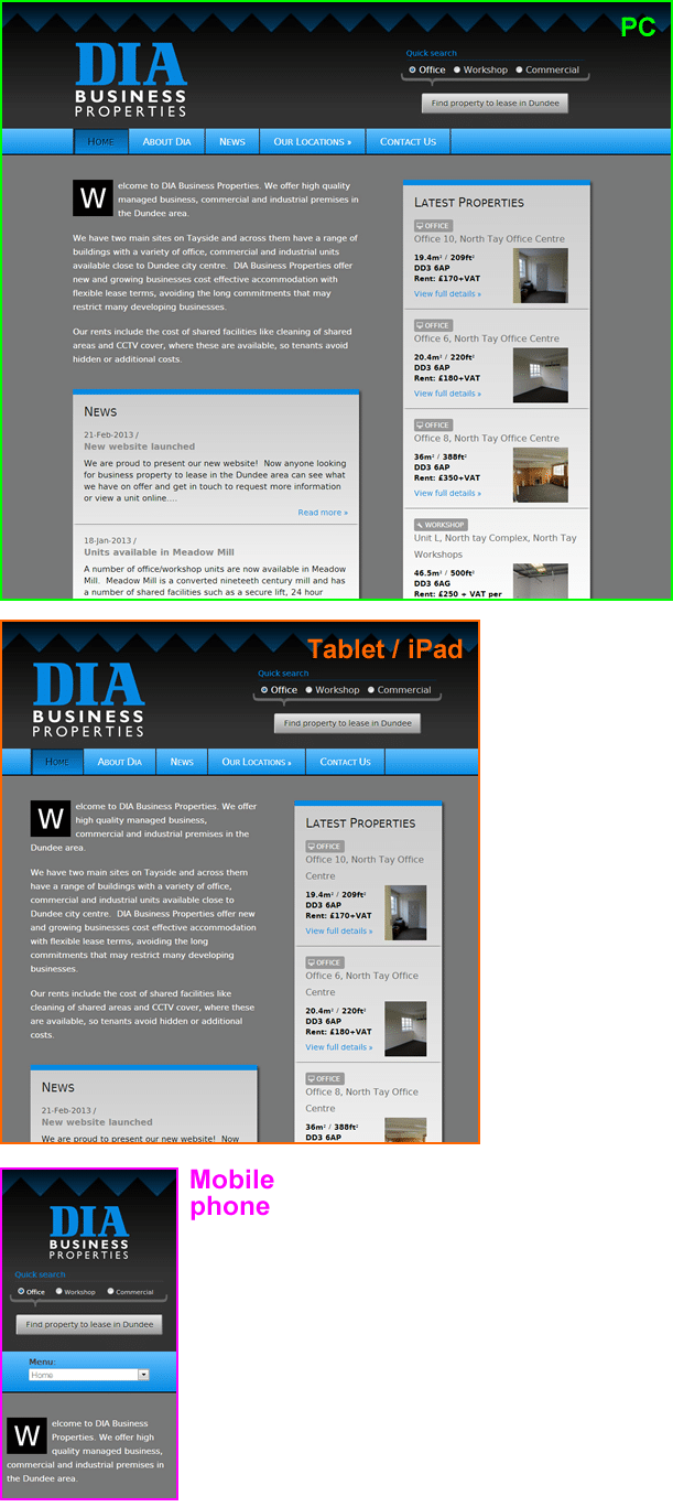
A responsive design takes into account the various possible screen sizes and adjusts the layout automatically. For example the following image shows the same site viewed through a number of different popular devices:
Although it might sound like responsive web design is the perfect solution for all web sites, there are certain limitations and compromises that are made when creating a single design that is designed to scale up and down. If a website is anticipating that a large number of viewers (i.e. around half or more) will be accessing the site using a mobile device, it can be worth having an entirely separate design.
Do I need a responsive web design?
When you are choosing a web designer, it’s worth asking if the site they are building you is responsive. As more and more people use their mobile phone or tablet to shop and browse the web, having a site that isn’t giving your visitors the best experience could put them off before you get a chance to communicate your message. My own personal opinion is that mobile use of the web has now reached critical mass and responsive design is absolutely essential.
As a leading web design studio serving the Dundee and Angus areas we are committed to responsive web design. From 2013 every site will be built using responsive web design techniques and tested on a variety of devices and screen sizes.